官网基础
定义样式
要创建一组样式,请在您的项目的 res/values/ 目录中保存一个 XML 文件。 可任意指定该 XML 文件的名称,但它必须使用 .xml 扩展名,并且必须保存在 res/values/ 文件夹内。
该 XML 文件的根节点必须是 <resources>。
对于您想创建的每个样式,向该文件添加一个 <style> 元素,该元素带有对样式进行唯一标识的 name 属性(该属性为必需属性)。然后为该样式的每个属性添加一个 <item> 元素,该元素带有声明样式属性以及属性值的 name(该属性为必需属性)。 根据样式属性,<item> 的值可以是关键字字符串、十六进制颜色值、对另一资源类型的引用或其他值。以下是一个包含单个样式的示例文件:
1 | <?xml version="1.0" encoding="utf-8"?> |
<resources> 元素的每个子项都会在编译时转换成一个应用资源对象,该对象可由 <style> 元素的 name 属性中的值引用。 可从 XML 布局以 @style/CodeFont 形式引用该示例样式(如上文引言中所示)。
<style> 元素中的 parent 属性是可选属性,它指定应作为此样式所继承属性来源的另一样式的资源 ID。 如果愿意,您可在随后替换这些继承的样式属性。
Fragment
向应用栏添加项目
您的片段可以通过实现 onCreateOptionsMenu() 向 Activity 的选项菜单(并因此向应用栏)贡献菜单项。不过,为了使此方法能够收到调用,您必须在onCreate() 期间调用 setHasOptionsMenu(),以指示片段想要向选项菜单添加菜单项(否则,片段将不会收到对 onCreateOptionsMenu() 的调用)。
您之后从片段添加到选项菜单的任何菜单项都将追加到现有菜单项之后。 选定菜单项时,片段还会收到对 onOptionsItemSelected() 的回调。
您还可以通过调用 registerForContextMenu(),在片段布局中注册一个视图来提供上下文菜单。用户打开上下文菜单时,片段会收到对onCreateContextMenu() 的调用。当用户选择某个菜单项时,片段会收到对 onContextItemSelected() 的调用。
注:尽管您的片段会收到与其添加的每个菜单项对应的菜单项选定回调,但当用户选择菜单项时,Activity 会首先收到相应的回调。 如果 Activity 对菜单项选定回调的实现不会处理选定的菜单项,则系统会将事件传递到片段的回调。 这适用于选项菜单和上下文菜单。
intent
1 | //验证是否存在接收intent的应用 |
1 | <!--隐式启动--> |
危险权限申请
1 | // Here, thisActivity is the current activity |
文件IO
1 | //基础写 |
room数据库的使用:
1 | //By default, Room creates a column for each field that's defined in the entity. |
相机
要求相关硬件
1 | <manifest ... > |
简单拍照/获取缩略图
1 | static final int REQUEST_IMAGE_CAPTURE = 1; |
获取唯一文件
1 | String mCurrentPhotoPath; |
拍照/原图
1 | static final int REQUEST_TAKE_PHOTO = 1; |
通知图库更新
1 | //可以让其他应用访问 |
尺寸压缩
1 | private void setPic() { |
调用相机录制视频
1 | //添加 <uses-feature android:name="android.hardware.camera" android:required="true" /> |
Sence
布局生成Sence
1 | Scene mAScene; |
代码创建Sence
1 | Scene mScene; |
Transition的创建
1 | //通过布局的方式创建 |
Transition应用有场景的转换
1 | //通常用于不同的视图切换 |
Transition应用无场景的转换(TransitionManager.beginDelayedTransition(rootview,flag) 用于记录视图层次结构)
1 | // Get the root view and create a transition |
PageTransformer
缩放效果(https://developer.android.google.cn/training/animation/anim_page_transformer_zoomout.mp4)
1 | public class ZoomOutPageTransformer implements ViewPager.PageTransformer { |
透明效果(https://developer.android.google.cn/training/animation/anim_page_transformer_depth.mp4)
1 | public class DepthPageTransformer implements ViewPager.PageTransformer { |
查看大图(https://developer.android.google.cn/training/animation/anim_zoom.mp4)
1 | private void zoomImageFromThumb(final View thumbView, int imageResId) { |
更改布局动画(添加、删除、更新)
1 | <!--在相应的布局中添加animateLayoutChanges = true--> |
尺寸限定符:
res/layout/main.xml,单窗格(默认)布局:
res/layout-large/main.xml,双窗格布局:
res/layout-sw600dp/main.xml,双窗格布局:(最小宽度大于或等于 600dp 的设备将选择 layout-sw600dp/main.xml)
NinePatch(.9图制作详情)
边框沿线的黑色像素。顶部和左侧边框上的黑色像素指示可以拉伸图像的位置,右侧和底部边框上的黑色像素则指示应该放置内容的位置。
DP
xhdpi:2.0hdpi:1.5mdpi:1.0(基准)ldpi:0.75
ConstraintLayout
官网有详细介绍 https://developer.android.google.cn/training/constraint-layout/index.html
Toolbar
1
2
3
4
5
6
7
8<android.support.v7.widget.Toolbar
android:id="@+id/my_toolbar"
android:layout_width="match_parent"
android:layout_height="?attr/actionBarSize"
android:background="?attr/colorPrimary"
android:elevation="4dp" 官方推荐
android:theme="@style/ThemeOverlay.AppCompat.ActionBar"
app:popupTheme="@style/ThemeOverlay.AppCompat.Light"/>SearchView
可以作为menu使用,也可以作为一个控件使用
1
2
3
4
5<item android:id="@+id/action_search"
android:title="@string/action_search"
android:icon="@drawable/ic_search"
app:showAsAction="ifRoom|collapseActionView"
app:actionViewClass="android.support.v7.widget.SearchView" />1
2
3
4
5
6
7
8
9
10
11
12
13
14
15
16
17
public boolean onCreateOptionsMenu(Menu menu) {
getMenuInflater().inflate(R.menu.main_activity_actions, menu);
MenuItem searchItem = menu.findItem(R.id.action_search);
SearchView searchView =
(SearchView) MenuItemCompat.getActionView(searchItem);
// Configure the search info and add any event listeners...
return super.onCreateOptionsMenu(menu);
}
//可以自定义各种状态下的icon
actionView.setOnCloseListener();//监听打开关闭
actionView.setOnSuggestionListener();//推荐列表
actionView.setOnQueryTextListener()//类似文本间监听 返回false自动收起键盘snackbar
1
2
3
4Snackbar mySnackbar = Snackbar.make(findViewById(R.id.myCoordinatorLayout),
R.string.email_archived,Snackbar.LENGTH_SHORT);
mySnackbar.setAction(R.string.undo_string, new MyUndoListener());
mySnackbar.show();管理系统界面
1
2
3
4
5
6
7
8
9// This example uses decor view, but you can use any visible view.
View decorView = getActivity().getWindow().getDecorView();
int uiOptions = View.SYSTEM_UI_FLAG_LOW_PROFILE;
decorView.setSystemUiVisibility(uiOptions);
View decorView = getActivity().getWindow().getDecorView();
// Calling setSystemUiVisibility() with a value of 0 clears
// all flags.
decorView.setSystemUiVisibility(0);隐藏状态栏
当失去焦点时会无效,比如触摸其他,后台重新进入界面
1
2
3
4
5
6
7
8
9
10
11
12
13
14
15
16
17
18
19
20
21
22
23
24
25
26
27
28
29
30
31
32
33
34
35
36
37
38
39
40View decorView = getWindow().getDecorView();
// Hide the status bar.
int uiOptions = View.SYSTEM_UI_FLAG_FULLSCREEN;
decorView.setSystemUiVisibility(uiOptions);
// Remember that you should never show the action bar if the
// status bar is hidden, so hide that too if necessary.
ActionBar actionBar = getActionBar();
actionBar.hide();
//配合setFitsSystemWindows()
View.SYSTEM_UI_FLAG_FULLSCREEN | //隐藏状态栏
View.SYSTEM_UI_FLAG_LAYOUT_FULLSCREEN| //内容填充状态栏
View.SYSTEM_UI_FLAG_LAYOUT_STABLE| //保持布局稳定
View.SYSTEM_UI_FLAG_HIDE_NAVIGATION|//隐藏导航虚拟按键
View.SYSTEM_UI_FLAG_LAYOUT_HIDE_NAVIGATION|//内容填充导航虚拟按键
View.SYSTEM_UI_FLAG_IMMERSIVE|//沉浸式全屏
View.SYSTEM_UI_FLAG_IMMERSIVE_STICKY//沉浸式全屏 划出状态栏,状态栏会自动消失
//处理状态栏被显示的问题
getWindow().getDecorView().setOnSystemUiVisibilityChangeListener
onWindowFocusChanged()
mDecorView.setOnSystemUiVisibilityChangeListener(new View.OnSystemUiVisibilityChangeListener() {
public void onSystemUiVisibilityChange(int visibility) {
// Note that system bars will only be "visible" if none of the
// LOW_PROFILE, HIDE_NAVIGATION, or FULLSCREEN flags are set.
if ((visibility & View.SYSTEM_UI_FLAG_FULLSCREEN) == 0) {
// TODO: The system bars are visible. Make any desired
// adjustments to your UI, such as showing the action bar or
// other navigational controls.
} else {
// TODO: The system bars are NOT visible. Make any desired
// adjustments to your UI, such as hiding the action bar or
// other navigational controls.
}
}
});Material Design
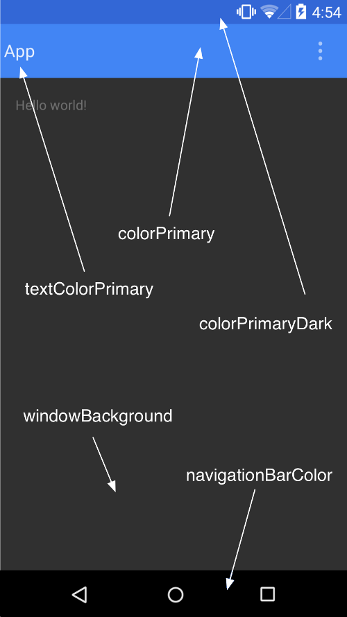
定制状态栏
1
2//当recycleview宽高不变时增删改查时提高性能
mRecyclerView.setHasFixedSize(true);阴影
1
2
3
4
5Z = elevation + translationZ
//自定义阴影轮廓,因为实际轮廓都是正方形
扩展 ViewOutlineProvider 类别。
替代 getOutline() 方法。
利用 View.setOutlineProvider() 方法向您的视图指定新的轮廓提供程序。定制动画
触摸反馈(水波纹)
1
2
3
4
5//矩形边框水波纹
android:background="?android:attr/selectableItemBackground"
//无边框限制水波纹
android:background="?android:attr/selectableItemBackgroundBorderless"自定义水波纹
1
2
3
4
5
6
7
8
9
10
11
12
13
14
15
16
17
18
19/**
* Creates a new ripple drawable with the specified ripple color and
* optional content and mask drawables.
* 通过指定波纹的颜色、操作内容、蒙板边界 创建新的ripple drawable 。
* @param color The ripple color 波纹颜色
* @param content The content drawable, may be {@code null} 指定content drawable
* @param mask The mask drawable, may be {@code null} 蒙板边界 、为null时,无边界
*/
public RippleDrawable(@NonNull ColorStateList color, @Nullable Drawable content,
@Nullable Drawable mask) {
...
}
RippleDrawable rd = new RippleDrawable(
ColorStateList.valueOf(
getResources().getColor(R.color.bg_gray)),
drawable,
getShape()
);
tvColor.setBackgroundDrawable(rd);揭露动画
1
2
3// create the animator for this view (the start radius is zero)
Animator anim =
ViewAnimationUtils.createCircularReveal(myView, cx, cy, 0, finalRadius);